NIAGARA DISTILLERY
Identity Design
Art Direction
Art Direction
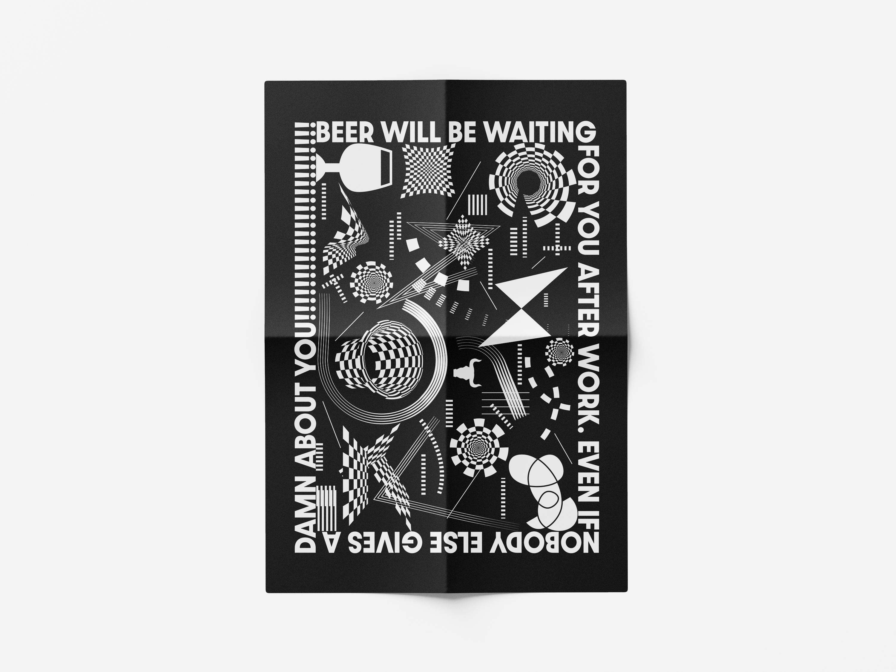
Insight: Niagara Distillery has a playful, energetic essence that is not currently reflected in its brand identity. Moreover, Alcohol's freeing effect and its association with playfulness could inform an intriguing design approach.
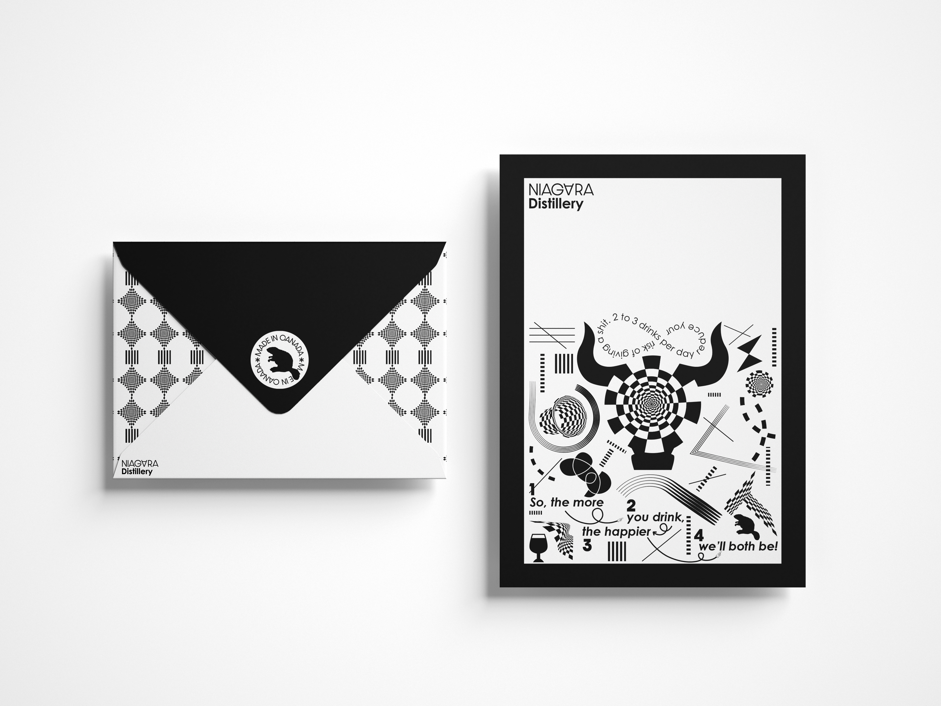
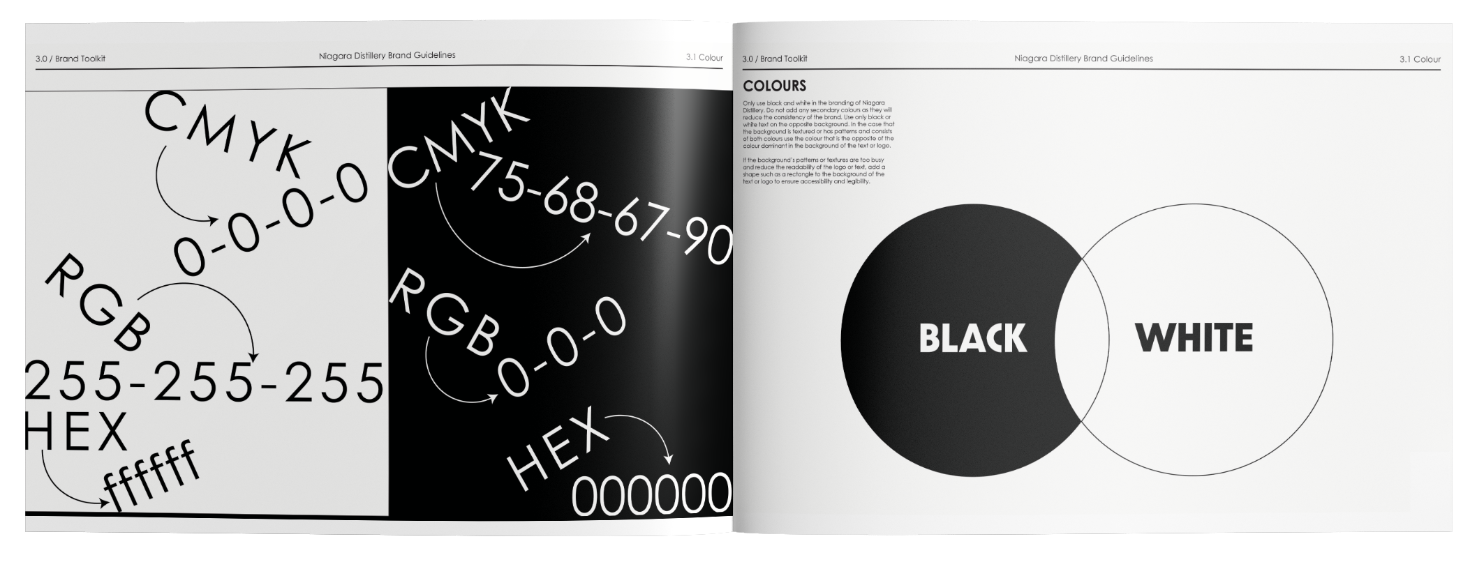
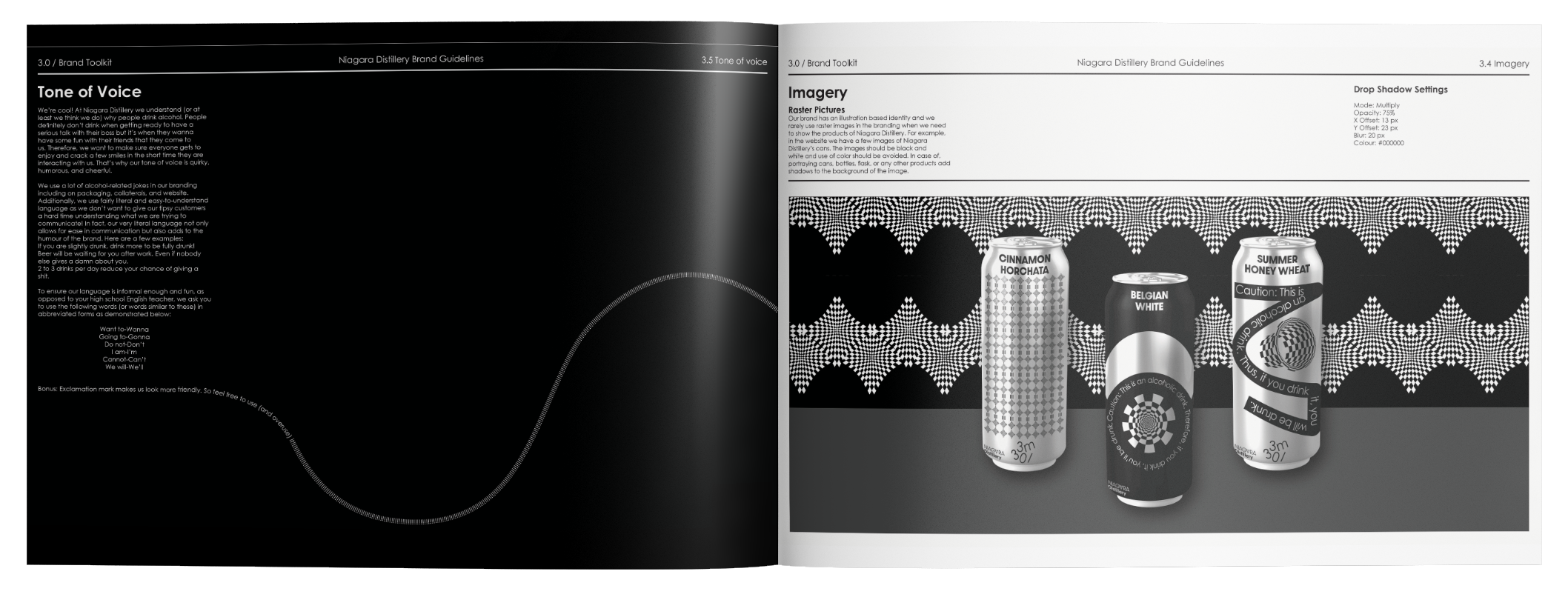
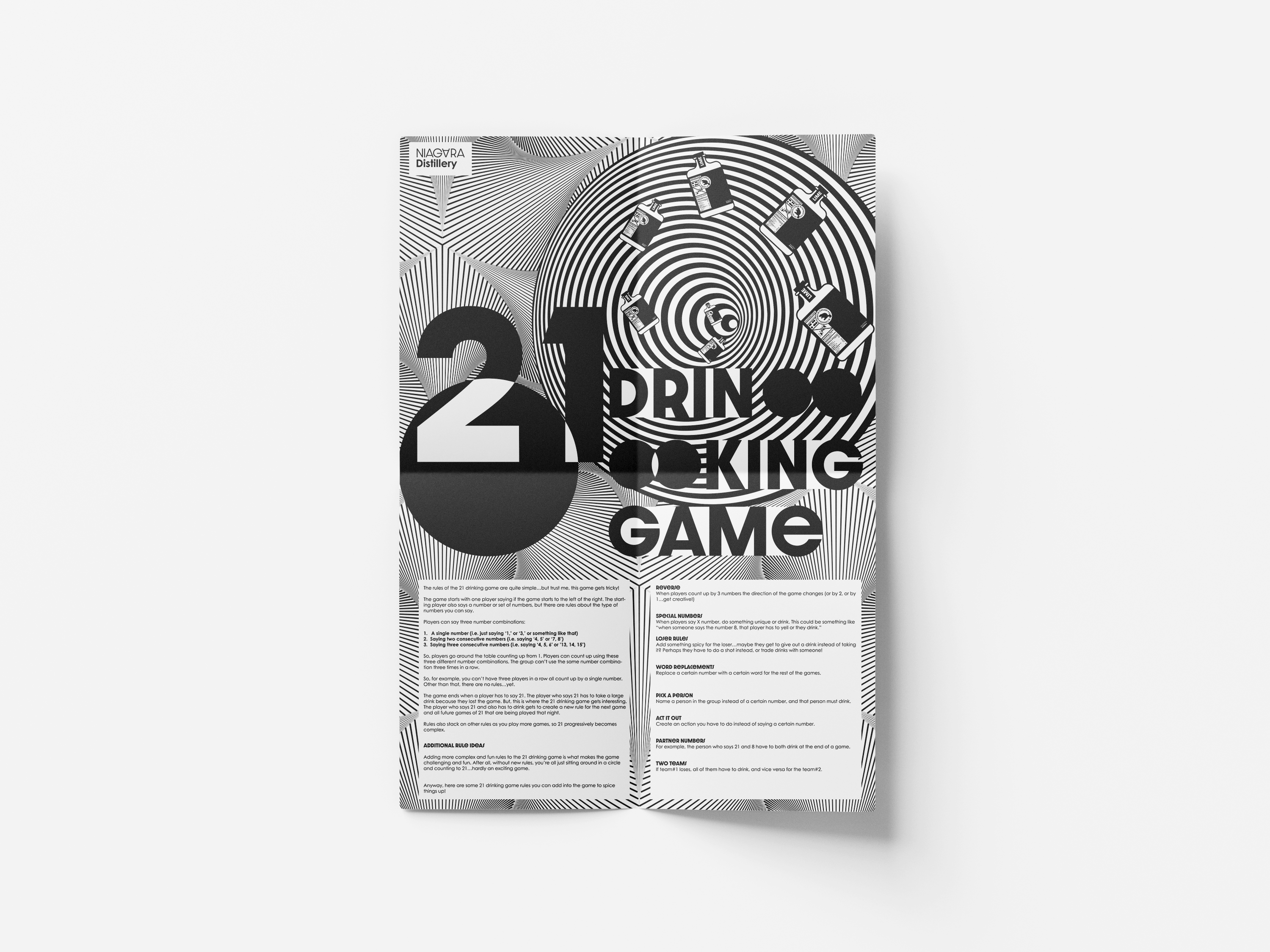
Strategy: Black and white colors were used to showcase sophistication. This was complemented by playful typography and visuals to infuse the identity system with energy. This strategic design aimed to enhance brand recognition and customer engagement, aligning with the brand's characteristics and the emotional connection associated with alcohol consumption.

